|
It has been a pleasure to come up with a new brand styling and logo design for the coming together of 4 medical centres to create a network hub for their local area and patients. There was quite a tight brief to use particular colours that also bought together the different areas with equal footing, this was the favoured final option...
0 Comments
It was great helping out new start-up Dark Mane with their logo/branding and box design, giving it the look and style that would launch well in their chosen area while standing out in the crowd. 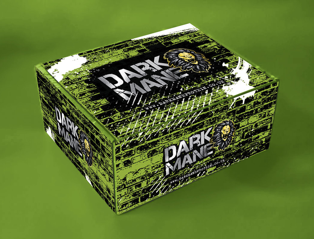 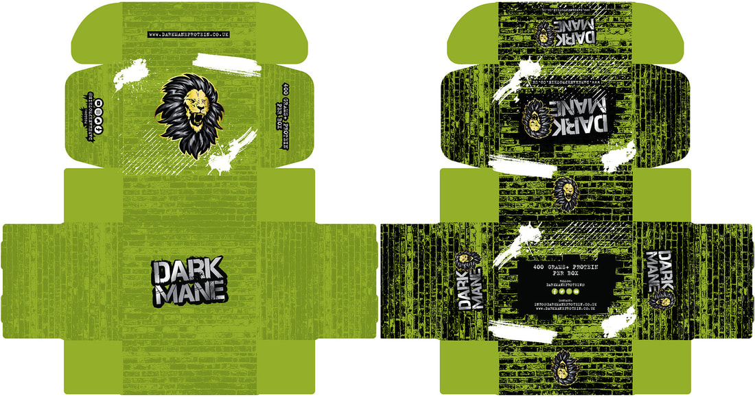 It's always a joy working with the people at The Hole in Wand and was a pleasure to expand the original logo design I had created for York to now represent both York AND Blaclpool's new 9 hole mini indoor golf course. Check out: www.theholeinwand.com/blackpool/ if you are in the area! A round up of some of my recent logo design work, lots of variation and styles as always! It's been a great pleasure to be involved with the opening of Potions Cauldron's new venture, The Potions Express! I came up with the logo, branding, signage and most of the packaging design for the products on sale inside, it's situated in York Train Station, kiosk under the stairs, Platform 5/8 ;) if you ever pass through take a look!
Three female company CEO's got together to form a new business to provide specialist online content from their 3 different areas of expertise. I took their head silhouette shapes and hairstyles to make the figures in a badge shape. They wanted a 90's hip hop style ie Notorious BIG (that's why - The Notorious Queens of Content). I went more corporate because the other contest entries were doing that and it paid off! The brief was to design artwork mixing the acoustic duo with their love of certain substances and 60's psychedelia. My entry came second but should still be used as part of their merchandise, I have also uploaded my other entry (on the right) as I thought that was the better design! 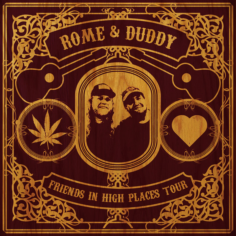 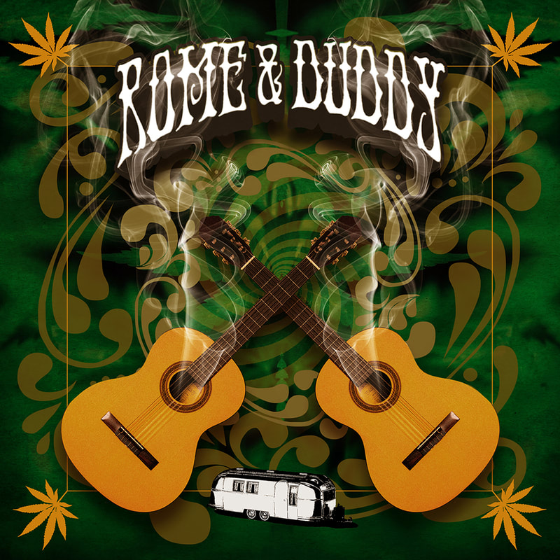 White Cane Day is on Oct 15, every year, in America, achievements of people with visual impairments are celebrated and organisations look to bring awareness to the independence of these individuals by highlighting the symbol of the white cane. This year there was a contest called #DripMyCane to help celebrate this day. The competition was to design a creative wrap for the canes. I wanted to come up with something visually arresting that had meaning but was also cool and positive. I had the idea of using the shades worn by John Samuel, who was the figurehead for the competition, as a basis, after all, shades are always cool! Here's my winning design with variations for how it could be used on the cane... 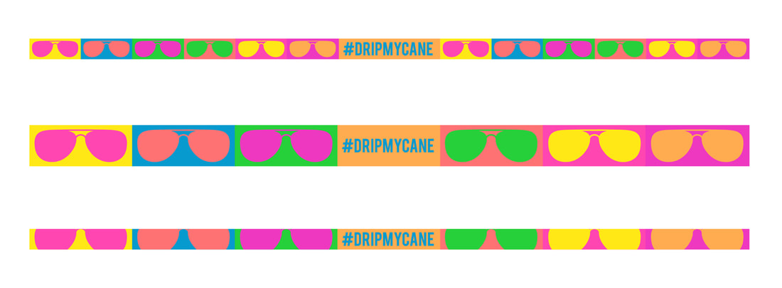 I can finally reveal I've won two further design competitions via Creative Allies! One a poster for Gary Busey Pet Judge (the TV show, it can be seen on Amazon Prime, it's as crazy as you'd expect from the title!). The other was a logo for HBCU Stars, an American organisation setup to help create more work opportunities for talented people of colour in industries that lack diversity and inclusivity, here they are... 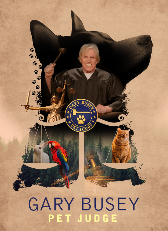 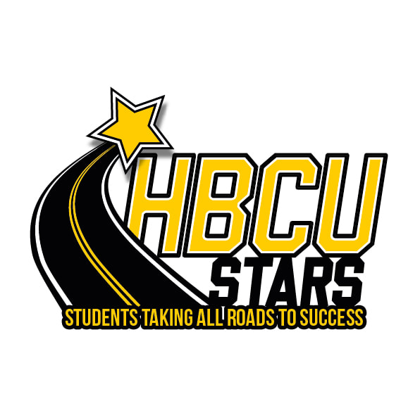 I entered a Creative Allies design competition in May to come up with a logo for USA soccer coach legend, Anson Dorrance, there were more than 160 entries, I won! Here's his announcement video... This was a good discipline to do, I haven't entered a competition in years. There were dozens of entries because of Covid-19 slowing down the amount of normal design work available. The prize money came in handy through these strange times. I enjoy designing minimalist and quite corporate logos and branding but it's also nice to draw up more fun logo designs too, two recent fun ones with very different backgrounds are these cheeky little characters...
6 years ago today it all started, thanks to all my clients for the continuined support and success!  An update and change of name for an already established business, sharing the old values and trust that they had built up with customers but with a new clean looking design for their brand reflecting the expansion into new areas. It's always a hard trick to pull off (when you have a new word that is trying to convey a message / feeling) coming up with a logo design / brand style that has something special about it and can also be readable straightaway. After many options and much tweaking one of my favourite logo designs appeared, here it is... ...new packaging and range coming soon!
|
AuthorInteresting things I've seen online and the latest Launch based news. Archives
December 2022
Categories |
 RSS Feed